{displayName:Name,// The value the user sees in the UIname:name,// The name used to reference the element UI within the codetype:string,required:true,// Whether the field is required or notdefault:'n8n',description:'The name of the user',displayOptions:{// the resources and operations to display this element withshow:{resource:[// comma-separated list of resource names],operation:[// comma-separated list of operation names]}},}
String field สำหรับกรอก password:
1 2 3 4 5 6 7 8 9101112131415161718192021
{displayName:'Password',name:'password',type:'string',required:true,typeOptions:{password:true,},default:'',description:`User's password`,displayOptions:{// the resources and operations to display this element withshow:{resource:[// comma-separated list of resource names],operation:[// comma-separated list of operation names]}},}
String field ที่มีหลายบรรทัด:
1 2 3 4 5 6 7 8 9101112131415161718192021
{displayName:'Description',name:'description',type:'string',required:true,typeOptions:{rows:4,},default:'',description:'Description',displayOptions:{// the resources and operations to display this element withshow:{resource:[// comma-separated list of resource names],operation:[// comma-separated list of operation names]}},}
{displayName:'Amount',name:'amount',type:'number',required:true,typeOptions:{maxValue:10,minValue:0,numberPrecision:2,},default:10.00,description:'Your current amount',displayOptions:{// the resources and operations to display this element withshow:{resource:[// comma-separated list of resource names],operation:[// comma-separated list of operation names]}},}
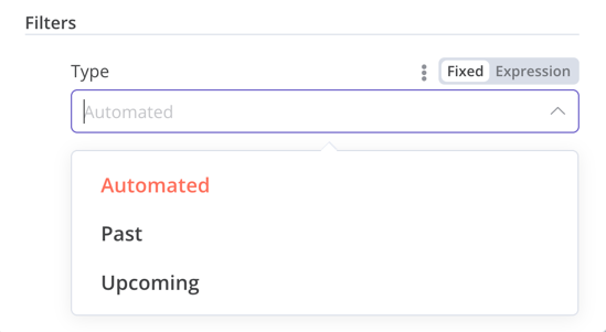
{displayName:'Filters',name:'filters',type:'collection',placeholder:'Add Field',default:{},options:[{displayName:'Type',name:'type',type:'options',options:[{name:'Automated',value:'automated',},{name:'Past',value:'past',},{name:'Upcoming',value:'upcoming',},],default:'',},],displayOptions:{// the resources and operations to display this element withshow:{resource:[// comma-separated list of resource names],operation:[// comma-separated list of operation names]}},}
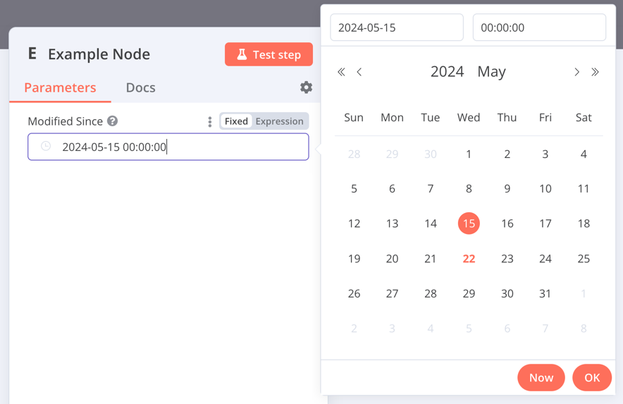
{displayName:'Modified Since',name:'modified_since',type:'dateTime',default:'',description:'The date and time when the file was last modified',displayOptions:{// the resources and operations to display this element withshow:{resource:[// comma-separated list of resource names],operation:[// comma-separated list of operation names]}},}
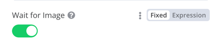
type boolean จะเพิ่ม toggle สำหรับเลือก true หรือ false
1 2 3 4 5 6 7 8 91011121314151617
{displayName:'Wait for Image',name:'waitForImage',type:'boolean',default:true,// Initial state of the toggledescription:'Whether to wait for the image or not',displayOptions:{// the resources and operations to display this element withshow:{resource:[// comma-separated list of resource names],operation:[// comma-separated list of operation names]}},}
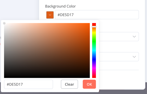
{displayName:'Background Color',name:'backgroundColor',type:'color',default:'',// Initially selected colordisplayOptions:{// the resources and operations to display this element withshow:{resource:[// comma-separated list of resource names],operation:[// comma-separated list of operation names]}},}
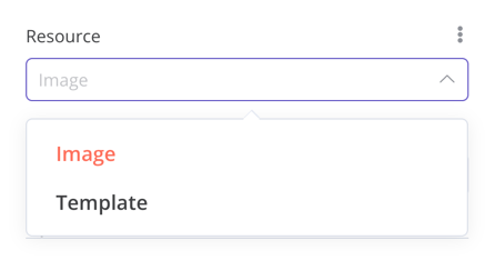
{displayName:'Resource',name:'resource',type:'options',options:[{name:'Image',value:'image',},{name:'Template',value:'template',},],default:'image',// The initially selected optiondescription:'Resource to consume',displayOptions:{// the resources and operations to display this element withshow:{resource:[// comma-separated list of resource names],operation:[// comma-separated list of operation names]}},}
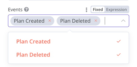
{displayName:'Events',name:'events',type:'multiOptions',options:[{name:'Plan Created',value:'planCreated',},{name:'Plan Deleted',value:'planDeleted',},],default:[],// Initially selected optionsdescription:'The events to be monitored',displayOptions:{// the resources and operations to display this element withshow:{resource:[// comma-separated list of resource names],operation:[// comma-separated list of operation names]}},}
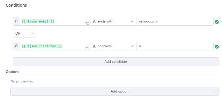
{displayName:'Conditions',name:'conditions',placeholder:'Add Condition',type:'filter',default:{},typeOptions:{filter:{// Use the user options (below) to determine filter behaviorcaseSensitive:'={{!$parameter.options.ignoreCase}}',typeValidation:'={{$parameter.options.looseTypeValidation ? "loose" : "strict"}}',},},},{displayName:'Options',name:'options',type:'collection',placeholder:'Add option',default:{},options:[{displayName:'Ignore Case',description:'Whether to ignore letter case when evaluating conditions',name:'ignoreCase',type:'boolean',default:true,},{displayName:'Less Strict Type Validation',description:'Whether to try casting value types based on the selected operator',name:'looseTypeValidation',type:'boolean',default:true,},],}
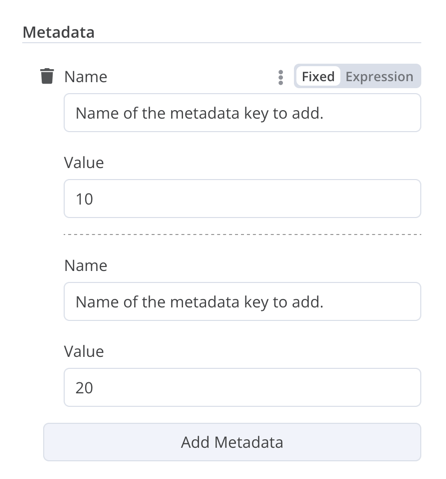
{displayName:'Metadata',name:'metadataUi',placeholder:'Add Metadata',type:'fixedCollection',default:'',typeOptions:{multipleValues:true,},description:'',options:[{name:'metadataValues',displayName:'Metadata',values:[{displayName:'Name',name:'name',type:'string',default:'Name of the metadata key to add.',},{displayName:'Value',name:'value',type:'string',default:'',description:'Value to set for the metadata key.',},],},],displayOptions:{// the resources and operations to display this element withshow:{resource:[// comma-separated list of resource names],operation:[// comma-separated list of operation names]}},}
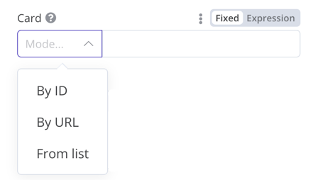
{displayName:'Card',name:'cardID',type:'resourceLocator',default:'',description:'Get a card',modes:[{displayName:'ID',name:'id',type:'string',hint:'Enter an ID',validation:[{type:'regex',properties:{regex:'^[0-9]',errorMessage:'The ID must start with a number',},},],placeholder:'12example',// How to use the ID in API callurl:'=http://api-base-url.com/?id={{$value}}',},{displayName:'URL',name:'url',type:'string',hint:'Enter a URL',validation:[{type:'regex',properties:{regex:'^http',errorMessage:'Invalid URL',},},],placeholder:'https://example.com/card/12example/',// How to get the ID from the URLextractValue:{type:'regex',regex:'example.com/card/([0-9]*.*)/',},},{displayName:'List',name:'list',type:'list',typeOptions:{// You must always provide a search method// Write this method within the methods object in your base file// The method must populate the list, and handle searching if searchable: truesearchListMethod:'searchMethod',// If you want users to be able to search the listsearchable:true,// Set to true if you want to force users to search// When true, users can't browse the list// Or false if users can browse a listsearchFilterRequired:true,},},],displayOptions:{// the resources and operations to display this element withshow:{resource:[// comma-separated list of resource names],operation:[// comma-separated list of operation names],},},},
{displayName:'Columns',name:'columns',// The name used to reference the element UI within the codetype:'resourceMapper',// The UI element typedefault:{// mappingMode can be defined in the component (mappingMode: 'defineBelow')// or you can attempt automatic mapping (mappingMode: 'autoMapInputData')mappingMode:'defineBelow',// Important: always set default value to nullvalue:null,},required:true,// See "Resource mapper type options interface" below for the full typeOptions specificationtypeOptions:{resourceMapper:{resourceMapperMethod:'getMappingColumns',mode:'update',fieldWords:{singular:'column',plural:'columns',},addAllFields:true,multiKeyMatch:true,supportAutoMap:true,matchingFieldsLabels:{title:'Custom matching columns title',description:'Help text for custom matching columns',hint:'Below-field hint for custom matching columns',},},},},
exportinterfaceResourceMapperTypeOptions{// The name of the method where you fetch the schema// Refer to the Resource mapper method section for more detailresourceMapperMethod:string;// Choose the mode for your operation// Supported modes: add, update, upsertmode:'add'|'update'|'upsert';// Specify labels for fields in the UIfieldWords?:{singular:string;plural:string};// Whether n8n should display a UI input for every field when node first added to workflow// Default is trueaddAllFields?:boolean;// Specify a message to show if no fields are fetched from the service // (the call is successful but the response is empty)noFieldsError?:string;// Whether to support multi-key column matching// multiKeyMatch is for update and upsert only// Default is false// If true, the node displays a multi-select dropdown for the matching column selectormultiKeyMatch?:boolean;// Whether to support automatic mapping// If false, n8n hides the mapping mode selector field and sets mappingMode to defineBelowsupportAutoMap?:boolean;// Custom labels for the matching columns selectormatchingFieldsLabels?:{title?:string;description?:string;hint?:string;};}
interfaceResourceMapperField{// Field ID as in the serviceid:string;// Field labeldisplayName:string;// Whether n8n should pre-select the field as a matching field// A matching field is a column used to identify the rows to modifydefaultMatch:boolean;// Whether the field can be used as a matching fieldcanBeUsedToMatch?:boolean;// Whether the field is required by the schemarequired:boolean;// Whether to display the field in the UI// If false, can't be used for matching or mappingdisplay:boolean;// The data type for the field// These correspond to UI element types// Supported types: string, number, dateTime, boolean, time, array, object, optionstype?:FieldType;// Added at runtime if the field is removed from mapping by the userremoved?:boolean;// Specify options for enumerated typesoptions?:INodePropertyOptions[];}
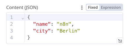
{displayName:'Content (JSON)',name:'content',type:'json',default:'',description:'',displayOptions:{// the resources and operations to display this element withshow:{resource:[// comma-separated list of resource names],operation:[// comma-separated list of operation names]}},}
HTML editor ให้ผู้ใช้สร้าง HTML template ใน workflow ได้ Editor รองรับ HTML มาตรฐาน, CSS ใน <style>, และ expression ใน {{}} ผู้ใช้สามารถเพิ่ม <script> เพื่อดึง JavaScript เพิ่มเติมได้ n8n จะไม่รัน JavaScript นี้ตอน workflow ทำงาน
1 2 3 4 5 6 7 8 91011
{displayName:'HTML Template',// The value the user sees in the UIname:'html',// The name used to reference the element UI within the codetype:'string',typeOptions:{editor:'htmlEditor',},default:placeholder,// Loads n8n's placeholder HTML templatenoDataExpression:true,// Prevent using an expression for the fielddescription:'HTML template to render',},
กำหนด hint ของ node ใน property hints ใน node description:
1 2 3 4 5 6 7 8 910111213141516171819
description:INodeTypeDescription={...hints:[{// The hint message. You can use HTML.message:"This node has many input items. Consider enabling <b>Execute Once</b> in the node\'s settings.",// Choose from: info, warning, danger. The default is 'info'.// Changes the color. info (grey), warning (yellow), danger (red)type:'info',// Choose from: inputPane, outputPane, ndv. By default n8n displays the hint in both the input and output panels.location:'outputPane',// Choose from: always, beforeExecution, afterExecution. The default is 'always'whenToDisplay:'beforeExecution',// Optional. An expression. If it resolves to true, n8n displays the message. Defaults to true.displayCondition:'={{ $parameter["operation"] === "select" && $input.all().length > 1 }}'}]...}
if(operation==='select'&&items.length>1&&!node.executeOnce){// Expects two parameters: NodeExecutionData and an array of hintsreturnnewNodeExecutionOutput([returnData],[{message:`This node ran ${items.length} times, once for each input item. To run for the first item only, enable <b>Execute once</b> in the node settings.`,location:'outputPane',},],);}return[returnData];
ดูตัวอย่างจริงของ dynamic hint ใน programmatic-style node ได้ที่ Split Out node code